
Table of Contents
Note: The teaching series, spread over 12 monthly articles, aims to provide a basic to intermediate understanding on a range of topics, including momentum, volatility, moving averages, basic patterns, cycles and the Elliott Wave Theory.
Moving average convergence divergence indicator (MACD) is a trend-following indicator that signals whether shorter-term price momentum is in the same direction as longer-term price momentum.
It is calculated by subtracting a 26 period exponential moving average (EMA) from a 12 period exponential moving average. The resultant single line plotted in a chart sub-window then has a 9 period exponential moving average plotted as a signal line. When the moving averages cross, the value is zero and this line is plotted across the centre of the subwindow as a reference. There are four basic signals:
1. MACD line crosses the zero line up from below
2. MACD line crosses the zero line down from above
3. MACD crosses the signal line up from below
4. MACD crosses the signal line down from above
The first signal is ostensibly bullish because in the chart it means that the shorter EMA (12) has crossed up the through the longer EMA(26) indicating that shorter timeframe power is exceeding longer timeframe power. The third signal is also ostensibly bullish inasmuch as the average of the MACD line/ signal line spread has converged with and the MACD has exceeded the signal line, carrying the same message. And vice versa, ostensibly bearish, for signals two and four.
Read more: Blocksmith Explains Relative Strength Index (RSI)
In all of the examples, I am using daily charts on the S&P 500 Index and the standard 26,12,9 MACD set up. The price being used is the close.
Note: MACD is not a bounded indicator that flows between zero and 100 (for example as RSI does) and it can go as low and as high as required.
MACD crosses up through zero line
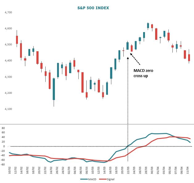
On 22 March 2022 the MACD line crossed up through the zero line (Figure 1). This simply means that the 12 day EMA passed up through the 26 day EMA as short term power increased over longer term power. Many technicians rely heavily on moving average crossovers, but agnostic of market environment they tend to test poorly.
In this example, price only rose some 6% after the zero line cross. One of the problems with MA crossover systems is that a lot of what you gain in terms of performance when the environment is trending, is given back when the market goes into its frequent consolidation phases. The MAs start criss crossing or whipsawing. These periods can lead to lots of small losses which end up eating away at trading results.
MACD crosses down through zero line

Figure 2 shows an MACD line zero cross down on 18 January 2022 after a straggly topping formation in prices. As for the zero cross up, but in reverse, what has happened is that the shorter 12 period EMA has crossed down through the longer 26 period EMA indicating that short term power is declining and that a price decline is likely.
However, as you can see from the chart there is a lot of price volatility after the signal which affects performance looking out across different intervals, something we will look at when testing the signals.
MACD crosses up through signal line
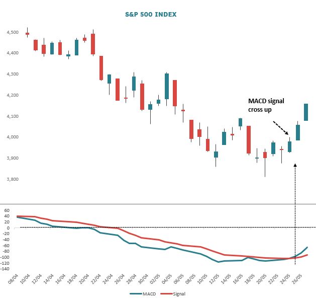
Figure 3 shows a good example of the MACD crossing up through the signal line. The environment here is “emerging out of deep oversold” inasmuch as MACD has very recently given a reading of -116, which is the lowest since April 2020 (where it emerged from an even deeper reading of -239 mid-March 2020). The MACD is falling hard below the zero line and then starts putting in a bullish divergence between 5 and 12 May 2022.
You will remember from the RSI lessons that this means although price is closing slightly lower, MACD starts to inflect higher indicating that downside power is starting to bleed out. On 24 March the MACD rose above the 9 period EMA red signal line and as you can see from the chart, price starts to rally. These MACD signal line up crosses can occur in many market environments, but the better set up is where MACD is very oversold and already putting in bullish divergences.
MACD crosses down through signal line
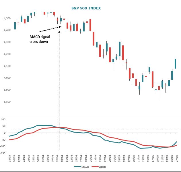
Figure 4 is an example of the MACD crossing down through the signal line. SPX Index rallied from 15 to 29 March 2022 and although the MACD line was still rising the signal line started to turn down (because its a moving average and was picking up that the rise in MACD was starting to get weaker). Thus the MACD and signal lines started to converge, implying that a down cross could be brewing. Most chartists tend to display this convergence as an extra histogram on the subwindow MACD chart. I tend to leave this out as it leads to too many false starts where you end up chasing the histogram.
On 8 April the MACD passes down through the signal line and then on 21 April down through the zero line. Price declines some 12%. This is a good return, but the test will show that signals are not all that they are cracked up to be and some do better than others.
Testing
I personally am somewhat suspicious of moving average systems, because on their own they tend to test poorly. The reason for this is that (as mentioned above) whipsaw phases tend to eat into profitable trend phase performance. One way to offset this is combine an MA system with something else. This could be as simple as looking to take signals in overbought or oversold environments only. Or it could be to confirm set ups in more esoteric systems like Cycle or Elliott Wave analysis. Lessons in these two approaches will come later in the series.
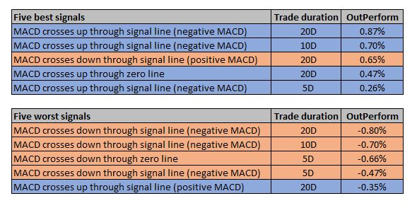
Figure 5 shows the results for a test performed on the S&P 500 Index at daily bar level from May 2012 to May 2022 – some 2,500 bars of data. There are 6 basic set ups: the MACD zero line cross up and down; the MACD signal line up cross with MACD above the zero line as well as below; the MACD signal line down cross with MACD above the zero line as well as below. For ostensibly bullish set ups I have gone long and for bearish set ups short. The average results of all signals generated has been tracked over 5, 10 and 20 days from the open the day after the signal. I have then compared these averages for all averages over 5, 10 and 20 days across the entire sample. This is the outperform column.
I show the five best and worst signals. Blue rows are for the bullish set ups, pink rows for the bearish. Only one bearish signal appears in the best signal set and only one bullish signal in the worst, implying that is better to use MACD for bullish signals. Recall that performance for the down set ups is a short sell, so if it’s negative the short has gone against you.


)