
Table of Contents
Note: The teaching series, spread over 12 monthly articles, aims to provide a basic to intermediate understanding on a range of topics, including momentum, volatility, moving averages, basic patterns, cycles and the Elliott Wave Theory.
We’re going to look at six set ups in RSI as well as cover some misconceptions. There are articles on the internet on how RSI is calculated, which I won’t go over in this note. It’s a good idea to study them and even try to recreate the indicator in Excel if you want to get a real sense for what is going on beneath the surface. The focus today is as follows:
- Overbought and Oversold misconceptions
- Bull & Bear ranges
- Bearish & Bullish divergences
In all of the examples, I am using daily charts and a 14-day RSI, the traditional lookback period for calculation. Note that if the lookback is too long, then RSI is sluggish and unresponsive. And if it’s too short, then it is too crazed and spiky. Note also that although RSI can be calculated off any price point during the session or a combination thereof, typically we use the closing price.
Overbought in an uptrend
Overbought is another way of saying that the price of a security is over motivated or stretched to the upside. It implies that buying power will start declining and therefore that price will fall. Traditionally, RSI overbought is put at 70.
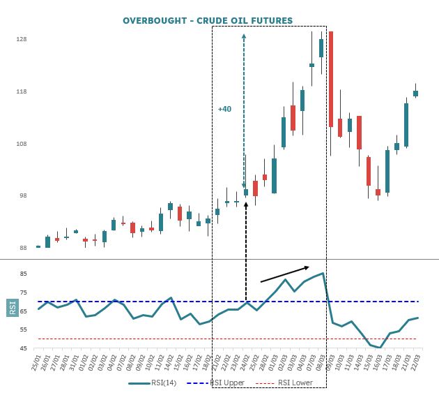
In Figure 1, I have a drawn a line at 70 in the RSI panel and show this level being exceeded on 24 February 2022. Price then went on to rally some 40%. By itself, 70 as overbought in an existing uptrend is misleading, because in fact it shows that there is a lot of pent up power and that price is more likely to rise.
Oversold in a downtrend
Oversold suggests that something is stretched to the downside. It implies that selling power will lessen and as a result that price will start rising. Traditionally, RSI oversold is set at 30.
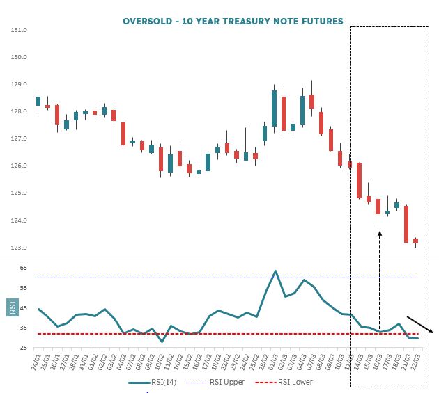
In Figure 2. I have drawn a line at 30 in the RSI panel and this level was exceeded on 16 March 2022. Price then went on to collapse. On its own, 30 as oversold in an existing downtrend implies that the downtrend is still in force and is not an invitation to step in and buy. Price is more likely to rest and then go lower.
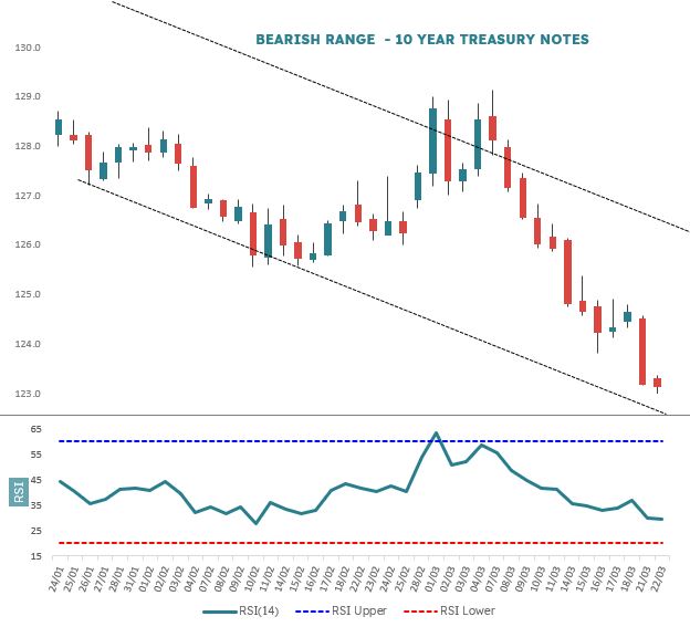
Bullish & Bearish Ranges
We have seen that fixed 70/30 overbought and oversold levels in RSI, regardless of the underlying market condition imperfectly call reversals. However, that is not to say that levels cannot usefully be applied. What we tend to see is that in an uptrend, RSI stays within the 40 and 80 range and in a downtrend it is in the 20 to 60 range.
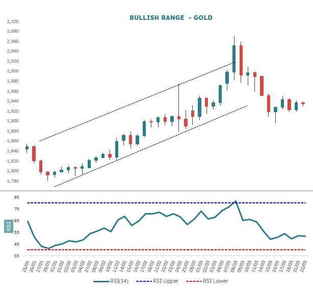
It’s best to use the exact levels as guidelines rather than hard and fast rules. But with that said, the ranges are very effective in giving you the overall tenor of the market. Figure 3 shows the recent uptrend in Gold and notice how well contained RSI is in the 40-80 Bull range, even into the last date after a sharp sell off. Figure 4 shows the 60-20 bear range in action.
Bearish divergence
A textbook bearish divergence in RSI is where price goes up, usually after a good rally, but RSI then starts going down. This speaks to the maturity of the price trend. If RSI (momentum) starts fading, then it means that the trend is slowing down and potentially nearing the end of its run. You’ll see this happen often in chart analysis and it’s as well to take note.
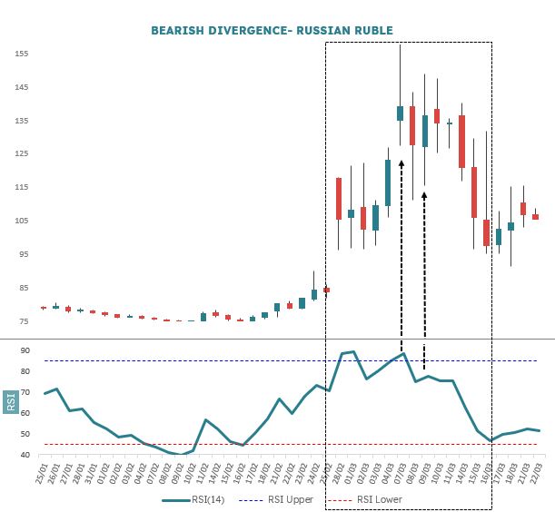
There is a more urgent signal, however, and this is when there is a dramatic drop in RSI over a couple of sessions and price either goes up a bit or stays about the same. Figure 5, is the Ruble. The 7 March Close is 138.9 and RSI is 88.6. We’re already on guard because this is very high. Two trading sessions later on 9 March the Close is similar at 136.4, but RSI has slumped to 77.7. The price difference across the two dates is -1.8%, but the RSI difference is -12.4% thus we have a sharp divergence over a short space of time. This sudden loss of power signalled the start of a precipitous decline. Think of it as a high speed stall to the upside.
Bullish divergence
Similar to a bearish divergence, however the bullish variant is a set up for a move higher. The classic interpretation is where price is in an extended decline and yet RSI starts creeping upwards – i.e. in the opposite direction. This signals that downside momentum is starting to weaken and suggests that the the downtrend is becoming exhausted – a precondition for an upside reversal and rally. You can think of RSI representing suction down and it’s not until the suction is absent that price can be released upwards again.
The more immediate set up is where there is a sudden stall in RSI as it jumps higher, but price either stays at the same sort of level or decreases further. Again, the best signals are tight and sharp, with few intervening sessions.
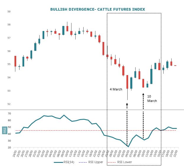
Figure 6 has the 4 March Close at 53.15 and RSI at 21.13, near the very bottom of the Bear range. Four sessions later on 10 March, the Close is 53.25 (just 0.2% higher), but RSI has jumped to 31 (47% higher). It’s obvious in the chart that there has been a rapid unwind and price starts to expand higher again.
Summary
We have looked at six basic set ups: overbought and oversold traps; the two ranges we expect to see RSI occupy during advances and declines; and sharp changes in RSI relative to price, often at the end of extended moves. This is a good starting point to have you thinking about RSI more like a market technician.
In the next note in this technical education series, I will cover some more esoteric patterns: support and resistance in RSI; positive and negative reversals; and hidden signals.


)